

Create neon buttons using html and CSS


We can easily create a neon effect button using HTML and CSS.
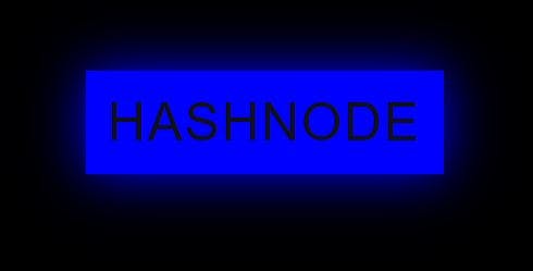
At first, we use HTML to give a basic boundary to the button we create. The anchor tag is used for creating a button and then hover in CSS is used for giving a neon background for the button.
Below is the code!!

<!DOCTYPE html>
<html lang="en" dir="ltr">

<head>
    <meta charset="utf-8">
    <title>
        neon button
    </title>

    <style>

        body {
            margin: 0;
            padding: 0;
            display: flex;
            height: 100vh;
            justify-content: center;
            align-items: center;
            background-color: #000;
            font-family: sans-serif;
        }


        a {
            padding: 20px 20px;
            display: inline-block;
            color: #0000FF;
            letter-spacing: 2px;
            text-transform: uppercase;
            text-decoration: none;
            font-size: 3em;
            overflow: hidden;
        }


        a:hover {
            color: #111;
            background: #0000FF;
            box-shadow: 0 0 50px #0000FF;
        }
    </style>
</head>

<body>
    <a>hashnode</a>
</body>

</html>